Redesigning Goodreads’ Discover page
Goodreads Discover (Savannah’s Version)
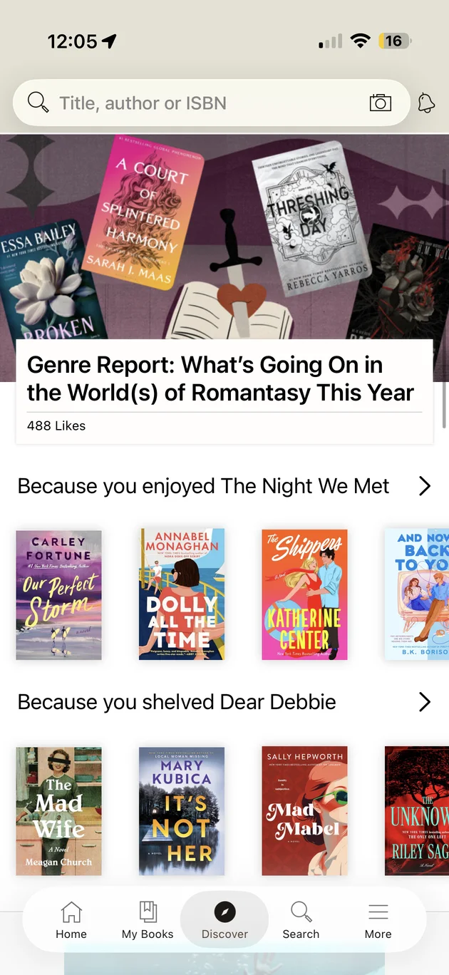
You open Discover hoping to find your next favorite book. What you get is a wall of covers, and a lot of them look awfully familiar, because the same books keep popping up row after row. No ratings, no hint of what the story is about, and no way to say “don’t recommend this to me” so the page can learn your taste.
My version keeps the covers, never shows you the same book twice, and puts you in charge of what you see.
The page today
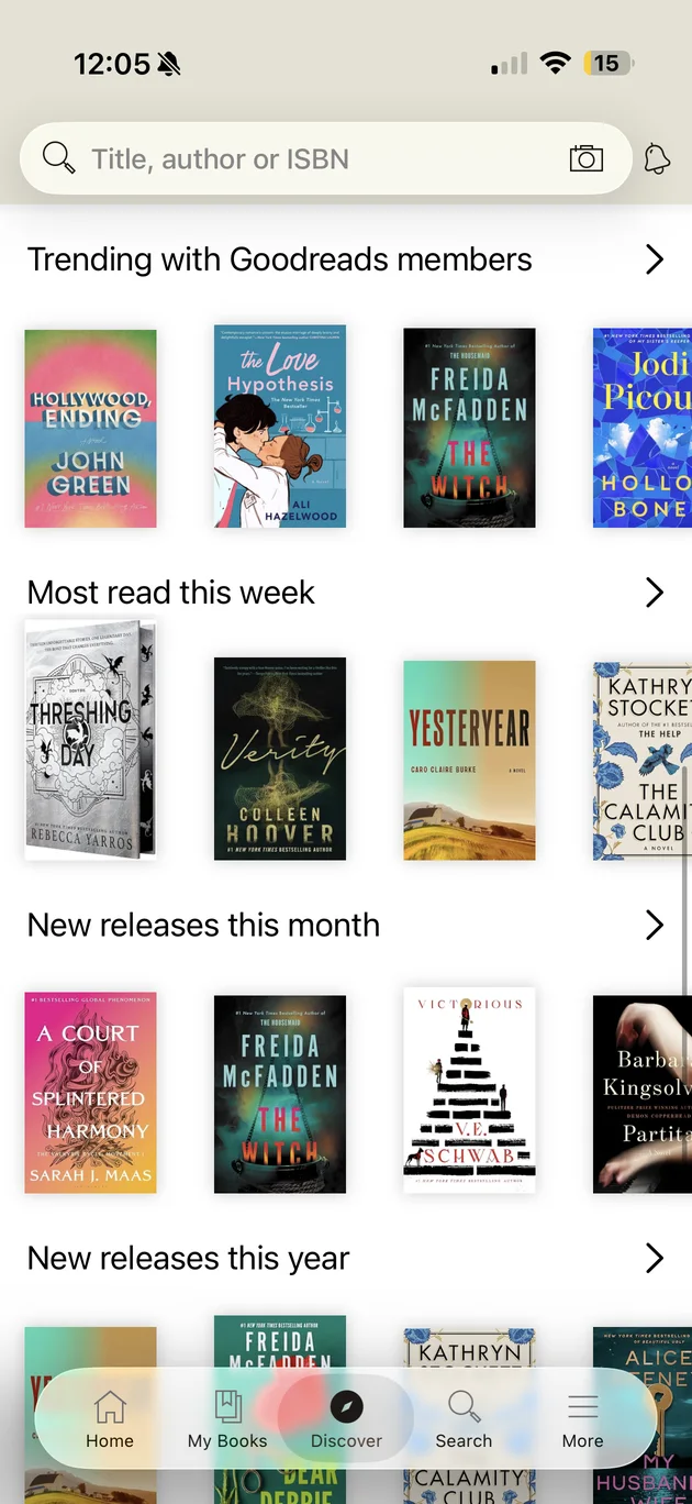
Discover opens with a search bar and one large editorial card, followed by rows of book covers. Two rows are personal ("Because you enjoyed…", "Because you shelved…"). Below them are generic rows: trending, most read this week, and new releases this month and this year.
What gets in the way
I went through the page as a reader looking for a book to start this weekend. Five problems stood out.
The same books repeat.
The same title can sit in three rows on one screen. The Witch appears in Trending, New releases this month and New releases this year. When the page repeats itself, it stops feeling like it knows my taste.
Observed in the app Mentioned in reviewsHeard in 1 interviewCovers carry all the weight.
Cards show a cover and nothing else. There is no star rating, genre or summary, and those are the first things I check when I decide whether to read something.
Observed in the appMy own habitsHeard in 2 interviews"Because you…" does not say why.
The row names a book I enjoyed, but not what it has in common with the books below it, so I can't judge whether the match makes sense.
Observed in the appTo test in interviewsNo way to narrow things down.
There are no genre, length or mood controls on the page. The only way to steer is to leave Discover and search.
Observed in the appMentioned in reviewsHeard in 2 interviewsIt is not built around how people find books now.
I often hear about a book on TikTok and then search it on Goodreads to check the rating. Discover doesn't pick up that moment, such as books that are being talked about or adapted into a movie or show.
My own experienceHeard in 2 interviews
Who it is for
I designed for heavy readers: people who read often, already know what they like, and are quickest to notice a page that repeats itself or ignores their taste. They often hear about books somewhere else, such as social media, friends, or authors they follow, so Goodreads is often the place where they check or log a book, not where they first find it.
How I got here
This is the path from the page as it is today to the redesign below.
- 1Named the problemsI used Discover as a heavy reader would and wrote down what slowed me down, then checked those against reviews and critiques of the app.
- 2Talked to readersI had two casual conversations with readers about how they find books. Both found their next read somewhere else first and used Goodreads to check it.
- 3Looked at other appsI compared how other book and recommendation apps help people decide, and noted what Goodreads leaves out.
- 4Sketched a basic layoutI listed what a better page needs: top books, new books, picks from reading history, each with a rating, genre, year, and a one-line summary.
- 5Designed it in FigmaI turned the layout into my own design, keeping Goodreads’ familiar feel, and checked each choice against the five problems.
The redesign
Here is how the new design answers each of the five problems above, in the same order. I kept the familiar search bar and rows of books so the page still feels like Goodreads, and made each row more useful.
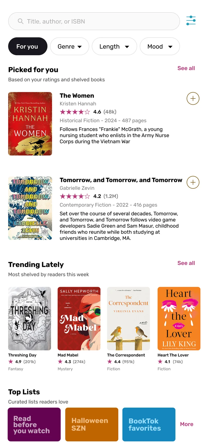
- 1ProblemThe same books repeatSolutionEach book gets one place on the page.Personal picks, trending books and curated lists each show different titles, so scrolling always shows something new.
- 2ProblemCovers carry all the weightSolutionCards carry the details readers use to decide.Rating and number of ratings, genre, year, page count and a one-sentence summary sit beside the cover. In the Trending row, rating and genre sit under each cover.
- 3Problem“Because you…” does not say whySolutionSay where the picks come from.The section reads “Based on your ratings and shelved books”, so the reason for the picks is stated up front. A quick “+” adds a book to Want to Read without leaving the page.
- 4ProblemNo way to narrow things downSolutionFilter chips at the top.Genre, Length and Mood sit right under the search bar, with a filter icon for everything else, so readers can steer Discover without leaving it.
- 5ProblemIt is not built around how people find books nowSolutionTop Lists built around how books spread.Tiles like “Read before you watch”, “Halloween SZN” and “BookTok favorites” give readers a reason to tap, and a Trending row shows what is being shelved most this week.
What I learned
Looking closely at a page I use all the time showed how much is decided by what a card leaves out. A cover is a good prompt to look at a book, but it is not enough to choose one. The redesign is mostly about adding the missing information and removing repetition, and I would rather prove that with readers than assume it.
Coming up next
The next chapter of this passion project: the Goodreads website. Open it right after the app and it feels like you have wandered into a different company. I want to find out what it would take to make the two feel like one story, so a reader never loses their place when they switch screens.